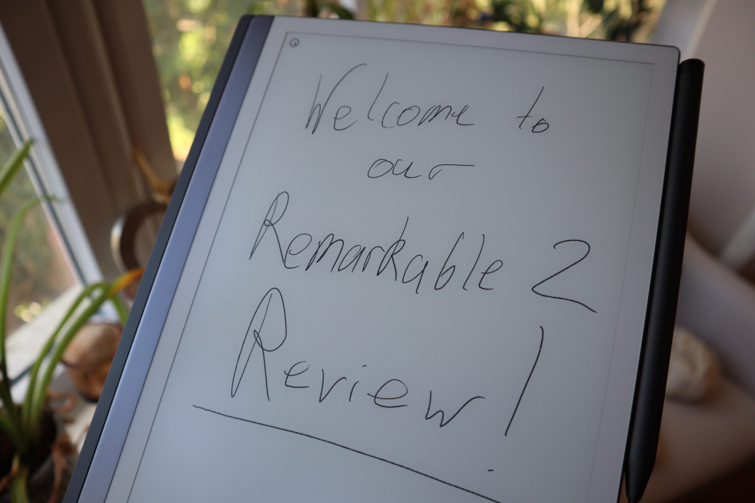
Verdict
While it won’t be appreciated by everyone, the Remarkable 2’s simplicity and scaled back approach make it easily accessible and a joy to use for note-taking and brainstorming.
Pros
- Distraction free writing experience
- Simple but elegant UI
- Large screen that’s easy to read in good conditions
Cons
- Limited feature set compared to the competition
- Very expensive when accessories are in the mix
- No backlight to speak of
Availability
- UKRRP: £299
- USARRP: $299
- EuropeRRP: €349
-
Paper like, e-ink display:Designed for note-taking and sketching -
Remarkable app:Read your notes on a smartphone or computer -
Quoted two-weeks of battery life:All from a single charge
Introduction
Even though high-end tablets can supplant laptops under certain situations, the Remarkable 2 aims to dial things back and emphasise the importance of traditional note-taking (with a modern twist).
While the concept of an e-ink tablet seemed fairly foreign when the Remarkable 1 hit the scene, the Remarkable 2 exists in a very different era where several companies are trying their hand at developing a digital notebook, the most mainstream (and recent) of which is the Kindle Scribe.
Still, it can take a moment to fully understand where devices like the Remarkable 2 fit in a space that also includes the iPad Pro M2 and Apple Pencil, and while I was plenty sceptical at the start of this review, an extended period of time with the Remarkable has forced me to change my tune.
Design
- Minimalist aesthetic
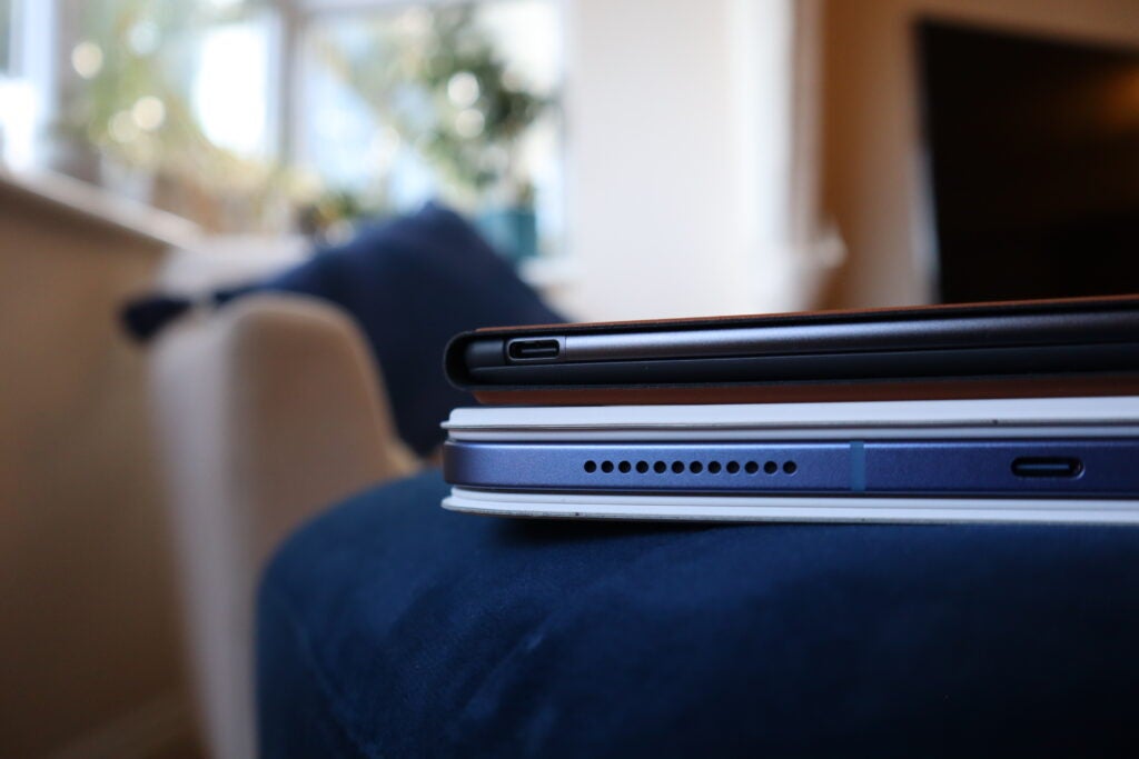
- Incredibly thin at just 4.7mm thick
- Very portable, weighing just 403.5g
It might sound derivative to say but I honestly believe that if Apple ever made an e-ink device, it might look a little bit like the Remarkable 2. Even down to how the device is marketed, this is a stylish product that embraces minimalism in almost every way.
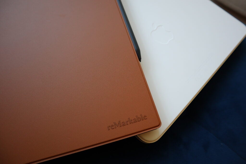
For starters, the Remarkable 2 is just barely thicker than the USB-C port that sits at the bottom of the device and as such, it only weighs in at a ridiculously light 403.5g. Despite its large 10.3-inch display and noteworthy bezels to boot, you can easily hold the Remarkable 2 with one hand and write with the other, and you’ll barely notice its presence when carried around in a rucksack.
With the exception of a power button at the top, there are no physical buttons to speak of – Remarkable has kept everything looking as clean as possible. There’s not even a mention of the branding on the front of the device (unlike a Kindle), with the Remarkable logo only visible from the back in about the same place you’d expect to see a half-eaten Apple.
I recognise that this level of thinness just isn’t possible on a traditional tablet just yet, but the Remarkable 2 makes me long for the day when I might be carrying around an ultra-slim iPad for a spot of work on the go.
Display
- 10.2-inch e-ink screen
- Easy to read in good light
- No built-in backlight
As mentioned, the Remarkable 2 packs a 10.3-inch display which I adore for several reasons, but there is one major setback that could end up influencing your decision to avoid the device completely.
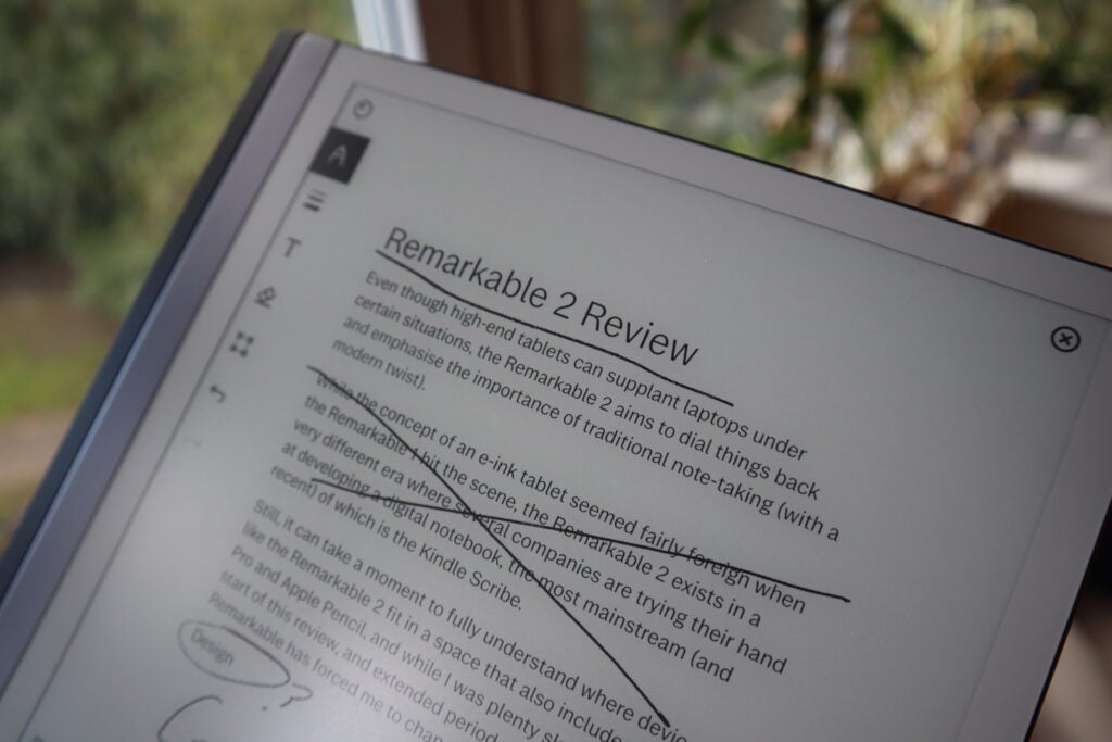
Running through its better elements first, the display (and the entire front-facing portion of the device) has a paper-like coating that immediately makes the Remarakble 2 feel better suited to digital note-taking than other tablets.
While the bezels may seem quite chunky compared to the competition, they offer up enough space for you to comfortably rest your thumb whilst holding the device, similar to the Kindle Oasis.
Everything looks sharp too with a 1872 x 1404 resolution (226 dpi), and while that’s not quite as sharp as what you’ll find on something like the Kindle Paperwhite, you’d be hard pressed to notice any jagged pixels in your notes.
So far so good but what really holds the Remarkable 2 back from greatness is that there isn’t any backlight to speak of, so unless you have a light source nearby, you can pretty much write off being able to use the device properly without hurting your eyes.
I remember having to scratch my head when the Playdate launched with no backlight and I’m just as dumbfounded over its absence on the Remarkable 2. The result of this is that for anyone who likes the idea of being able to read in bed or jot down any last minute ideas for the day, you might be better served with looking at e-ink tablets like the Onyx Boox Note Air 2 Plus which features an adjustable backlight.
Features and performance
- A brilliantly simplified UI
- Writing feels like the real thing
- Let down by cost and service integration
Much like with the design, the team at Remarkable has gone with a ‘less is more’ approach to the device’s feature-set and for the most part, this philosophy absolutely does the trick.
At its core, the Remarkable 2’s user interface is very easy to get to grips with – in fact, I can’t remember the last device I used where it took so little time to understand where everything is and how to use it.
On the main homepage you have the taskbar at the top which lets you make a folder, a new notebook or simply add to your ‘Quick Sheets’ page which is meant for in-the-moment note-taking. Below that you’ll see the list of files you have as well as the most recent documents you’ve been working on, and with the exception of the menu tab that let’s you rearrange the homepage and head into the settings, that’s it.
This is as pared-down an experience as you’ll find in the modern age of tech, but I found myself appreciating the Remarkable’s sensibility over time. For instance, I didn’t have to worry about reading notifications or being distracted by other apps – it just gets me to my notebooks as quickly as possible, which is exactly what you want from this type of device.
It’s also incredibly easy to see your notes on other devices – the Remarkable 2 syncs everything to your account so you can read your notes in pinch via the Remarkable desktop and phone apps, handy if you’ve left your Remarkable 2 at home.
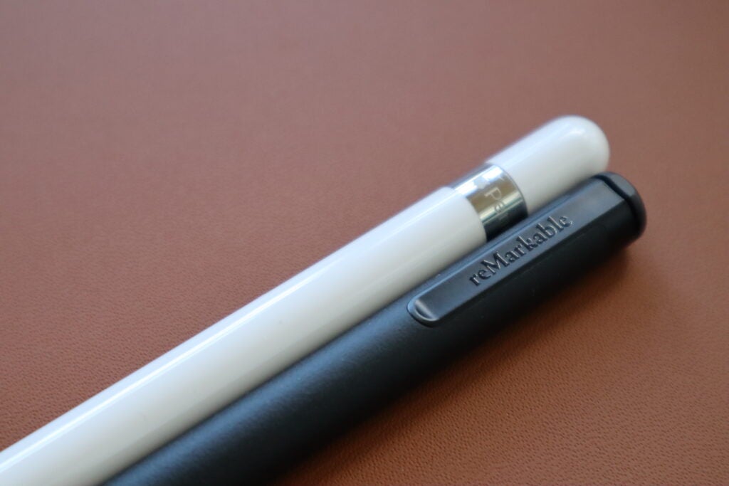
When you do have the Remarkable 2 to hand however, the writing experience is unparalleled. There is no noticeable delay in seeing your writing appear onscreen and the paper-like surface of the display just makes the whole thing feel as natural as writing on a traditional notepad. It’s leagues better than using the Apple Pencil and hearing the harsh taps against the iPad’s glass display, although anyone looking to draw with different colours will still be swayed by what iPads have to offer.
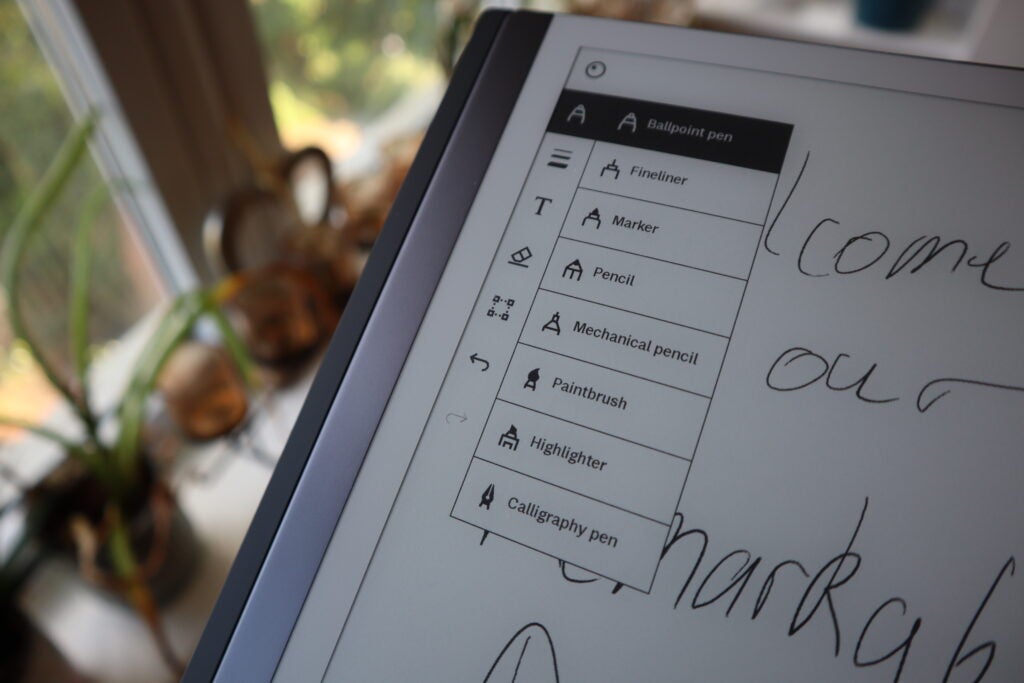
Some of the pen styles do let you inject a bit of colour into your notes but unfortunately, because of the Remarkable 2’s monochrome screen, they can only be seen in the Remarkable app. The other pen styles will only let you choose between black, white or grey, which isn’t exactly a dealbreaker but it does mean that those looking to draw digital art may be better suited with an iPad
One of my favourite features here is the official ‘Send to Remarkable’ browser extension which scans the page that you’re on and sends a text-only version of it straight to your device. When I’ve needed to proofread something on the way into work, this little trick has been invaluable – sending a document to the Remarkable 2 before leaving the house so that I can dive in on the train with handwritten notes and no need to mess around with public Wi-Fi.
Unfortunately, the intuitiveness of ‘Send to Remarkable’ hasn’t carried over to the Google Drive and One Drive integration. You can’t edit documents in ‘live mode’ as you might on a phone or computer, instead you have to save a local copy of a document to the Remarkable which then needs to be exported out of the Remarkable app and back into Google Drive if you want to use it there. The whole thing is such a mess that I don’t recommend using the integration system at all.
There’s also an underlying issue with the Remarkable 2 that’s worth knowing about before investing, and that’s the price. The Remarkable 2 itself costs £299/$299/€349 which isn’t too bad, but with the additional kit that was sent with my review unit, including the Marker Plus (£109/$129/€129) and the Type Folio keyboard case (£179/$199/€199), the entire package would have set anyone back a whopping £587/$627/€677 at the checkout.
Of course, there are cheaper versions of both the stylus and the case that you can buy, but your experience is hampered somewhat if you don’t opt for the priciest kit. The Marker Plus for example has a digital eraser at the end of it which feels so seamless that I can’t imagine using the Remarkable 2 without it.
On top of all this there’s the optional, but arguably necessary, £2.99/$2.99/€2.99 a month Connect subscription. Opting in to Connect gives you unlimited cloud storage amongst other things, but its most crucial feature is that it lets you edit your documents on other devices via the Remarkable app. This means that if you don’t have a Connect subscription, there’s no way to edit any of the documents you’ve made on the Remarkable elsewhere. Given its low cost, it’s definitely worth opting into the service as it’s a far better experience to use the app with all its features intact, but it’s worth bearing this additional cost in mind before buying.
Type Folio Keyboard
- Fairly pricey
- Wonderful travel on the keys
- The software isn’t optimised to make full use of it
Unlike the Marker Plus which feels like an essential accessory for the Remarkable 2, the Type Folio keyboard is a different story.
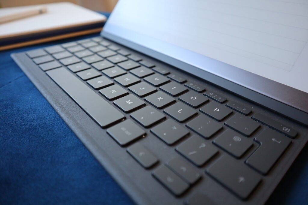
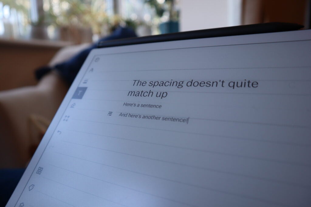
On the one hand, it’s so unbelievably slim that I can’t quite wrap my head around it, and yet it still holds a decent amount of travel within its keys which makes the typing itself feel great. What isn’t ideal is that the software isn’t optimised to use the Type Folio in the way that you’d like. Typing on a blank page is fine but if you use a lined page as your background, your typing doesn’t stay within those lines which makes any document look like a bit of a mess just a few sentences in.
Still, if you don’t mind typing on a blank screen, there’s something to be said here about the Remarkable 2 (with the Type Folio in tow) being the ideal device for writing a novel on.
After all, it comes with zero distractions and plenty of battery life to boot, so while I wouldn’t recommend the expense for everyone, there are some use cases where the Type Folio feels apropos.
Battery Life
- Quoted two-weeks of battery
- Ran for almost a month in our testing
- Almost three hours to fully charge
As you might expect from an e-ink device, battery life on the Remarkable 2 is outstanding. The company claims that you can get two weeks of battery life on a single charge, but I’ve managed to get through 27 days before hitting the 10% mark, and that was from using the Remarkable 2 on most weekdays for notes at work.
What this means is that you can easily stretch past that two-week mark under general use, and when the average person already has several devices that need to be charged daily, it’s always appreciated when you have something that can actually go the distance.
Charging the device is a somewhat slow affair, as it took me roughly two hours and 45 minutes to reach a full battery from 0%, but at the very least it isn’t something you’ll have to deal with often given how long the battery can hold out between charges.
Latest deals
Should you buy it?
You want a clutter free, note-taking experience: Without any notifications or apps to get in the way, the Remarkable 2 recreates the simplicity of pen and paper but infuses it with enough modern trappings to make it feel like a worthwhile upgrade from your old notebook.
You need a backlight: The Remarkable 2’s cost is one thing but the lack of a backlight is a real dealbreaker, and if you can’t imagine going without one then the Onyx Boox devices offer a similar e-ink experience with a backlight to boot.
Final Thoughts
Going into this review, I was somewhat sceptical about how useful a stripped-back digital notebook could be but after using the Remarkable 2 for over a month, I can’t imagine going to work without it.
For taking notes in meetings, quickly adding things to my to-do list or simply needing to get away from my emails for a minute to brainstorm some ideas, the Remarkable 2 has been nothing but exemplary.
Its high cost, particularly when you factor in the accessories, prevent the Remarkable 2 from being a must-buy for everyone, and it’s hampered by the absence of a backlight but if you just want a simple experience that gives you the ability to take digital notes without being hampered by a cluttered user interface, then the Remarkable 2 is well worth checking out.
For a better reading experience with a larger screen, the Kindle Scribe is your best bet while the iPad Mini 6 or iPad 10th Gen present a better overall package for drawing digital art.
How we test
Unlike other sites, we thoroughly test every product we review. We use industry standard tests in order to compare features properly. We’ll always tell you what we find. We ever, ever accept money to review a product.
Compared against similar devices
FAQs
The Connect subscription costs £2.99 a month and opens up additional features for the Remarkable 2 including unlimited cloud storage, an extended warranty and the ability to edit your documents via the Remarkable app on other devices.
No, both versions of the Remarkable pen are sold separately, with prices starting at £59.
Yes, you can import ePUB files to the Remarkable 2 but there is no built-in storefront for buying books on the deivce.
Sustainability
TrustedReviews’ holds the fact that global warming is not a myth as a core value and will continuously endeavour to help protect our planet from harm in its business practices.
As part of this mission, whenever we review a product we send the company a series of questions to help us gauge and make transparent the impact the device has on the environment.
We currently haven’t received answers to the questions on this product, but will update this page the moment we do. You can see a detailed breakdown of the questions we ask and why in our sustainability info page.
Jargon buster
DPI
DPI stands for “Dots Per Inch” and measures the sensitivity of a mouse. A higher DPI figure will see the mouse cursor travel a greater distance from the same wrist movement, making it very useful for competitive gaming.
Verdict
While it won’t be appreciated by everyone, the Remarkable 2’s simplicity and scaled back approach make it easily accessible and a joy to use for note-taking and brainstorming.
Pros
- Distraction free writing experience
- Simple but elegant UI
- Large screen that’s easy to read in good conditions
Cons
- Limited feature set compared to the competition
- Very expensive when accessories are in the mix
- No backlight to speak of
Availability
- UKRRP: £299
- USARRP: $299
- EuropeRRP: €349
-
Paper like, e-ink display:Designed for note-taking and sketching -
Remarkable app:Read your notes on a smartphone or computer -
Quoted two-weeks of battery life:All from a single charge
Introduction
Even though high-end tablets can supplant laptops under certain situations, the Remarkable 2 aims to dial things back and emphasise the importance of traditional note-taking (with a modern twist).
While the concept of an e-ink tablet seemed fairly foreign when the Remarkable 1 hit the scene, the Remarkable 2 exists in a very different era where several companies are trying their hand at developing a digital notebook, the most mainstream (and recent) of which is the Kindle Scribe.
Still, it can take a moment to fully understand where devices like the Remarkable 2 fit in a space that also includes the iPad Pro M2 and Apple Pencil, and while I was plenty sceptical at the start of this review, an extended period of time with the Remarkable has forced me to change my tune.
Design
- Minimalist aesthetic
- Incredibly thin at just 4.7mm thick
- Very portable, weighing just 403.5g
It might sound derivative to say but I honestly believe that if Apple ever made an e-ink device, it might look a little bit like the Remarkable 2. Even down to how the device is marketed, this is a stylish product that embraces minimalism in almost every way.

For starters, the Remarkable 2 is just barely thicker than the USB-C port that sits at the bottom of the device and as such, it only weighs in at a ridiculously light 403.5g. Despite its large 10.3-inch display and noteworthy bezels to boot, you can easily hold the Remarkable 2 with one hand and write with the other, and you’ll barely notice its presence when carried around in a rucksack.
With the exception of a power button at the top, there are no physical buttons to speak of – Remarkable has kept everything looking as clean as possible. There’s not even a mention of the branding on the front of the device (unlike a Kindle), with the Remarkable logo only visible from the back in about the same place you’d expect to see a half-eaten Apple.
I recognise that this level of thinness just isn’t possible on a traditional tablet just yet, but the Remarkable 2 makes me long for the day when I might be carrying around an ultra-slim iPad for a spot of work on the go.

Display
- 10.2-inch e-ink screen
- Easy to read in good light
- No built-in backlight
As mentioned, the Remarkable 2 packs a 10.3-inch display which I adore for several reasons, but there is one major setback that could end up influencing your decision to avoid the device completely.
Running through its better elements first, the display (and the entire front-facing portion of the device) has a paper-like coating that immediately makes the Remarakble 2 feel better suited to digital note-taking than other tablets.
While the bezels may seem quite chunky compared to the competition, they offer up enough space for you to comfortably rest your thumb whilst holding the device, similar to the Kindle Oasis.
Everything looks sharp too with a 1872 x 1404 resolution (226 dpi), and while that’s not quite as sharp as what you’ll find on something like the Kindle Paperwhite, you’d be hard pressed to notice any jagged pixels in your notes.
So far so good but what really holds the Remarkable 2 back from greatness is that there isn’t any backlight to speak of, so unless you have a light source nearby, you can pretty much write off being able to use the device properly without hurting your eyes.

I remember having to scratch my head when the Playdate launched with no backlight and I’m just as dumbfounded over its absence on the Remarkable 2. The result of this is that for anyone who likes the idea of being able to read in bed or jot down any last minute ideas for the day, you might be better served with looking at e-ink tablets like the Onyx Boox Note Air 2 Plus which features an adjustable backlight.
Features and performance
- A brilliantly simplified UI
- Writing feels like the real thing
- Let down by cost and service integration
Much like with the design, the team at Remarkable has gone with a ‘less is more’ approach to the device’s feature-set and for the most part, this philosophy absolutely does the trick.
At its core, the Remarkable 2’s user interface is very easy to get to grips with – in fact, I can’t remember the last device I used where it took so little time to understand where everything is and how to use it.
On the main homepage you have the taskbar at the top which lets you make a folder, a new notebook or simply add to your ‘Quick Sheets’ page which is meant for in-the-moment note-taking. Below that you’ll see the list of files you have as well as the most recent documents you’ve been working on, and with the exception of the menu tab that let’s you rearrange the homepage and head into the settings, that’s it.
This is as pared-down an experience as you’ll find in the modern age of tech, but I found myself appreciating the Remarkable’s sensibility over time. For instance, I didn’t have to worry about reading notifications or being distracted by other apps – it just gets me to my notebooks as quickly as possible, which is exactly what you want from this type of device.

It’s also incredibly easy to see your notes on other devices – the Remarkable 2 syncs everything to your account so you can read your notes in pinch via the Remarkable desktop and phone apps, handy if you’ve left your Remarkable 2 at home.
When you do have the Remarkable 2 to hand however, the writing experience is unparalleled. There is no noticeable delay in seeing your writing appear onscreen and the paper-like surface of the display just makes the whole thing feel as natural as writing on a traditional notepad. It’s leagues better than using the Apple Pencil and hearing the harsh taps against the iPad’s glass display, although anyone looking to draw with different colours will still be swayed by what iPads have to offer.
Some of the pen styles do let you inject a bit of colour into your notes but unfortunately, because of the Remarkable 2’s monochrome screen, they can only be seen in the Remarkable app. The other pen styles will only let you choose between black, white or grey, which isn’t exactly a dealbreaker but it does mean that those looking to draw digital art may be better suited with an iPad
One of my favourite features here is the official ‘Send to Remarkable’ browser extension which scans the page that you’re on and sends a text-only version of it straight to your device. When I’ve needed to proofread something on the way into work, this little trick has been invaluable – sending a document to the Remarkable 2 before leaving the house so that I can dive in on the train with handwritten notes and no need to mess around with public Wi-Fi.

Unfortunately, the intuitiveness of ‘Send to Remarkable’ hasn’t carried over to the Google Drive and One Drive integration. You can’t edit documents in ‘live mode’ as you might on a phone or computer, instead you have to save a local copy of a document to the Remarkable which then needs to be exported out of the Remarkable app and back into Google Drive if you want to use it there. The whole thing is such a mess that I don’t recommend using the integration system at all.
There’s also an underlying issue with the Remarkable 2 that’s worth knowing about before investing, and that’s the price. The Remarkable 2 itself costs £299/$299/€349 which isn’t too bad, but with the additional kit that was sent with my review unit, including the Marker Plus (£109/$129/€129) and the Type Folio keyboard case (£179/$199/€199), the entire package would have set anyone back a whopping £587/$627/€677 at the checkout.
Of course, there are cheaper versions of both the stylus and the case that you can buy, but your experience is hampered somewhat if you don’t opt for the priciest kit. The Marker Plus for example has a digital eraser at the end of it which feels so seamless that I can’t imagine using the Remarkable 2 without it.
On top of all this there’s the optional, but arguably necessary, £2.99/$2.99/€2.99 a month Connect subscription. Opting in to Connect gives you unlimited cloud storage amongst other things, but its most crucial feature is that it lets you edit your documents on other devices via the Remarkable app. This means that if you don’t have a Connect subscription, there’s no way to edit any of the documents you’ve made on the Remarkable elsewhere. Given its low cost, it’s definitely worth opting into the service as it’s a far better experience to use the app with all its features intact, but it’s worth bearing this additional cost in mind before buying.
Type Folio Keyboard
- Fairly pricey
- Wonderful travel on the keys
- The software isn’t optimised to make full use of it
Unlike the Marker Plus which feels like an essential accessory for the Remarkable 2, the Type Folio keyboard is a different story.
On the one hand, it’s so unbelievably slim that I can’t quite wrap my head around it, and yet it still holds a decent amount of travel within its keys which makes the typing itself feel great. What isn’t ideal is that the software isn’t optimised to use the Type Folio in the way that you’d like. Typing on a blank page is fine but if you use a lined page as your background, your typing doesn’t stay within those lines which makes any document look like a bit of a mess just a few sentences in.

Still, if you don’t mind typing on a blank screen, there’s something to be said here about the Remarkable 2 (with the Type Folio in tow) being the ideal device for writing a novel on.
After all, it comes with zero distractions and plenty of battery life to boot, so while I wouldn’t recommend the expense for everyone, there are some use cases where the Type Folio feels apropos.
Battery Life
- Quoted two-weeks of battery
- Ran for almost a month in our testing
- Almost three hours to fully charge
As you might expect from an e-ink device, battery life on the Remarkable 2 is outstanding. The company claims that you can get two weeks of battery life on a single charge, but I’ve managed to get through 27 days before hitting the 10% mark, and that was from using the Remarkable 2 on most weekdays for notes at work.
What this means is that you can easily stretch past that two-week mark under general use, and when the average person already has several devices that need to be charged daily, it’s always appreciated when you have something that can actually go the distance.
Charging the device is a somewhat slow affair, as it took me roughly two hours and 45 minutes to reach a full battery from 0%, but at the very least it isn’t something you’ll have to deal with often given how long the battery can hold out between charges.

Latest deals
Should you buy it?
You want a clutter free, note-taking experience: Without any notifications or apps to get in the way, the Remarkable 2 recreates the simplicity of pen and paper but infuses it with enough modern trappings to make it feel like a worthwhile upgrade from your old notebook.
You need a backlight: The Remarkable 2’s cost is one thing but the lack of a backlight is a real dealbreaker, and if you can’t imagine going without one then the Onyx Boox devices offer a similar e-ink experience with a backlight to boot.
Final Thoughts
Going into this review, I was somewhat sceptical about how useful a stripped-back digital notebook could be but after using the Remarkable 2 for over a month, I can’t imagine going to work without it.
For taking notes in meetings, quickly adding things to my to-do list or simply needing to get away from my emails for a minute to brainstorm some ideas, the Remarkable 2 has been nothing but exemplary.
Its high cost, particularly when you factor in the accessories, prevent the Remarkable 2 from being a must-buy for everyone, and it’s hampered by the absence of a backlight but if you just want a simple experience that gives you the ability to take digital notes without being hampered by a cluttered user interface, then the Remarkable 2 is well worth checking out.
For a better reading experience with a larger screen, the Kindle Scribe is your best bet while the iPad Mini 6 or iPad 10th Gen present a better overall package for drawing digital art.
How we test
Unlike other sites, we thoroughly test every product we review. We use industry standard tests in order to compare features properly. We’ll always tell you what we find. We ever, ever accept money to review a product.
Compared against similar devices
FAQs
The Connect subscription costs £2.99 a month and opens up additional features for the Remarkable 2 including unlimited cloud storage, an extended warranty and the ability to edit your documents via the Remarkable app on other devices.
No, both versions of the Remarkable pen are sold separately, with prices starting at £59.
Yes, you can import ePUB files to the Remarkable 2 but there is no built-in storefront for buying books on the deivce.
Sustainability
TrustedReviews’ holds the fact that global warming is not a myth as a core value and will continuously endeavour to help protect our planet from harm in its business practices.
As part of this mission, whenever we review a product we send the company a series of questions to help us gauge and make transparent the impact the device has on the environment.
We currently haven’t received answers to the questions on this product, but will update this page the moment we do. You can see a detailed breakdown of the questions we ask and why in our sustainability info page.
Jargon buster
DPI
DPI stands for “Dots Per Inch” and measures the sensitivity of a mouse. A higher DPI figure will see the mouse cursor travel a greater distance from the same wrist movement, making it very useful for competitive gaming.


