First Impressions
EE TV is an intriguing proposition as EE lays out its vision of TV’s future. It does seem more tailored to existing BT customers, especially as it requires take up of BT Broadband. The inclusion of the Apple TV 4K as an option might be the game-changing feature that convinces people to take up EE TV.
Cons
- Requires take up of BT Broadband
-
Record up to 600 hours1TB of storage for the EE TV Box Pro -
AudioSupports Dolby Atmos immersive sound -
AppsAccess to app such as Netflix, Prime Video, Apple TV+ and others
Introduction
Something new comes this way and it’s called EE TV. After EE’s splashy relaunch in October, its taking over the reins from BT and becoming the front-facing consumer brand the British telecoms giant is hoping will push it towards into a brighter future in the living room.
It’s not the first EE has tried to invade the living room, but I imagine they’ll hope it fare better than the last set-top box they tried.
On a gloomy December afternoon, I went over to BT’s offices to see a demonstration of the new service. The proof will be in the pudding once customers have had the chance to fully interact with it, but first impressions are of a slick, integrated, if familiar view for TV’s future.
Design
- Choices of three set-top boxes
- Bluetooth remotes
- Sleek, discreet appearance
EE TV launches with three boxes, one of which might surprise you.
There’s the EE TV Box Pro, which replaces the BT TV Box Pro from a couple years back.

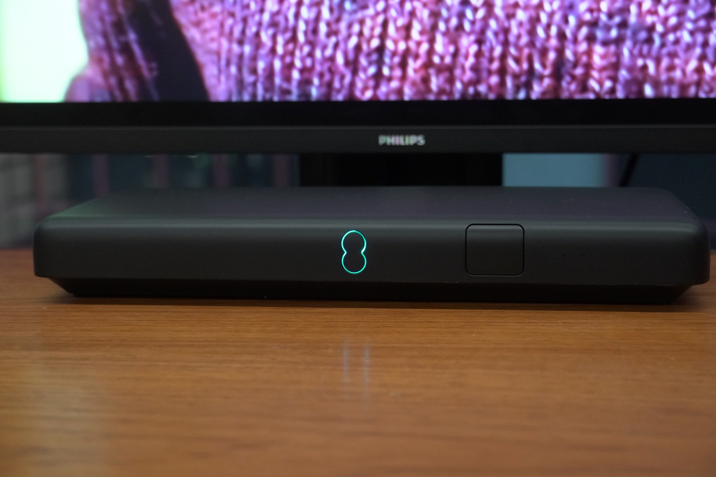
The design is similar in that it’s not an especially tall box, with slim dimensions and rounded edges. Its matte black finish gives it a discreet appearance. There’s the EE TV logo (an infinity sign of sorts) that glows green in the centre that’s used to power the box on and off.
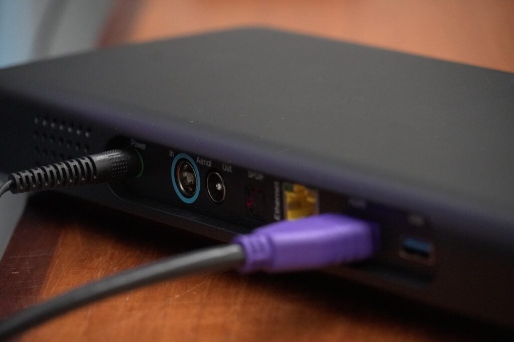
Around the back are the connections, which includes an aerial input, but EE is not expecting that to be the main means of connection. All the EE TV boxes are focused on delivering content over the Internet through Wi-Fi or Ethernet. Much like Sky Stream, think of the aerial input as a back-up in case the Internet goes down.
The design of the EE TV Box Mini shares the same aesthetic but smaller, and EE TV sees this as the box for second rooms in the house – kitchens, bedrooms, anywhere big enough to house a screen. It doesn’t come with an aerial so it’s Wi-Fi (Ethernet) or bust with this option.

Both boxes were designed by Tej Chauhan, whose work goes back to the early 2000s when he was the lead designer on the Nokia 7370 phone. And both boxes have outer casings made from up to 95% recycled plastic, with the box packaging able to be both “recycled and recyclable”.
The third option is the Apple TV 4K. Yes, that Apple TV 4K. It’s like any other current Apple box but carries a bespoke version of the EE TV app integrated within the Apple TV ecosystem. Buy an Apple TV 4K from another retailer and you won’t get the same app, but you’ll be able to download what EE describes as a companion version.
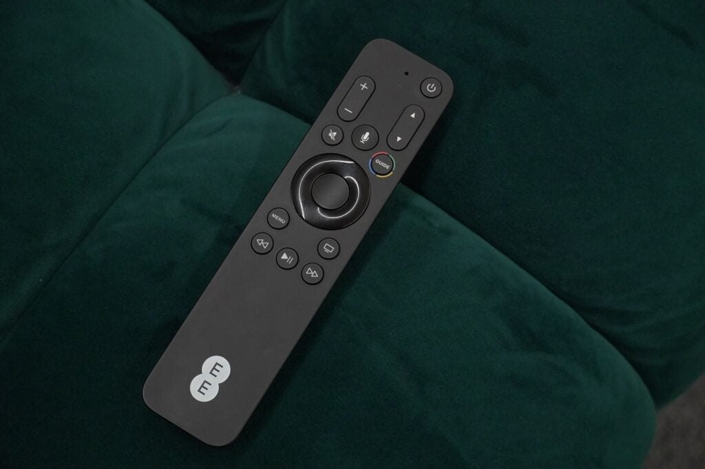
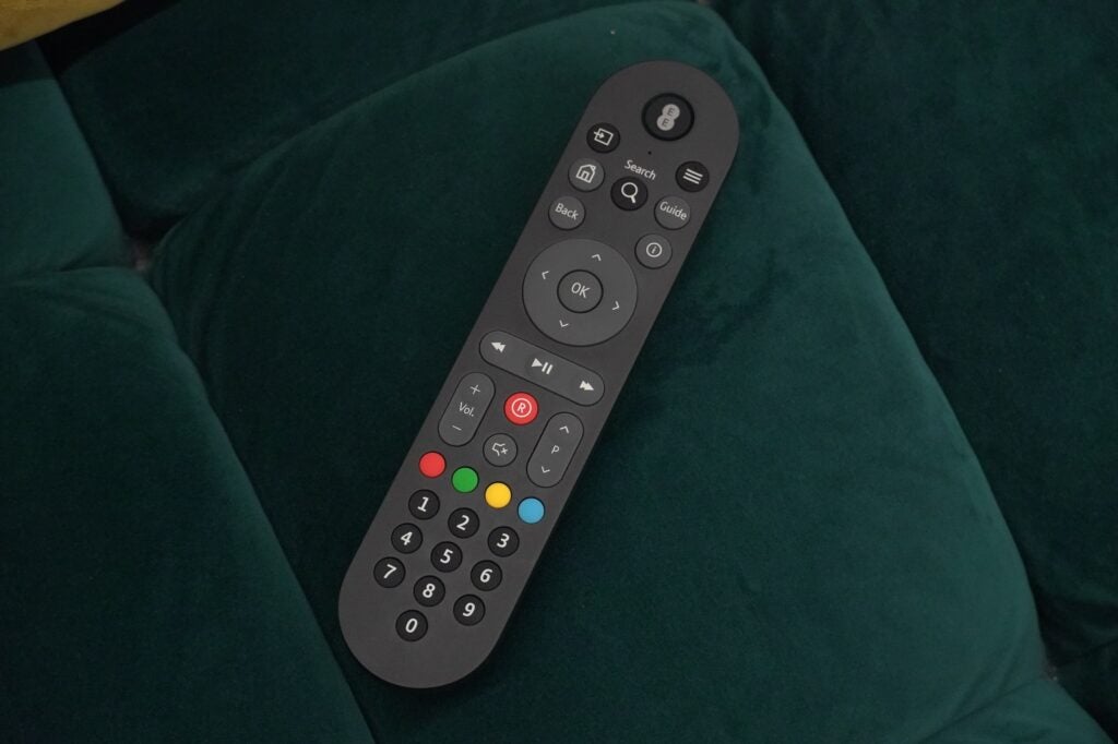
The remote is also a point of difference from other Apple 4K boxes – bigger and with more buttons such as fast-forward and back, a ‘Guide’ button, channel selection and more. For the EE TV boxes, you get the same wand whichever model you purchase, which has the appearance of a more conventional remote with its layout and buttons.
The remote connects to the set-top box via Bluetooth, so you can put the box in your AV rack and close the covers which shouldn’t affect operation. If the remote gets lost (say an errant child has taken off with it), press the logo on the unit and WPS button at the same time and the remote will chime to locate it.
Interface
- Fluid sense of navigation
- Aggregates content from UK catch-up apps
- Combination of personsalised content and curated
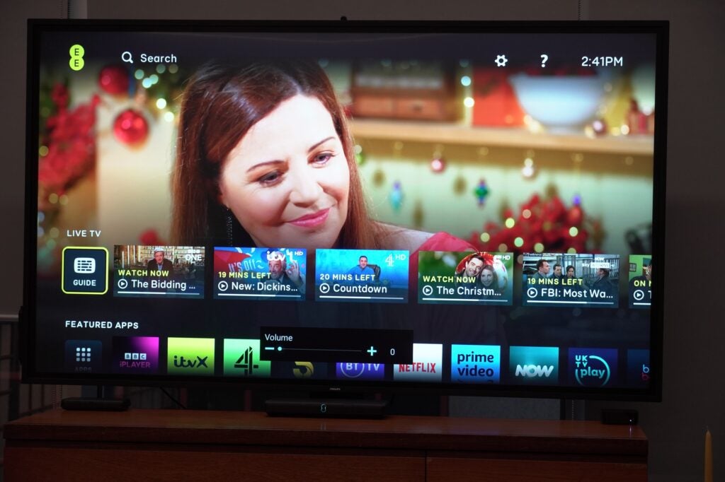
Here’s the meat of the streaming sandwich EE TV is offering. The driving force behind the UI is the intention to keep things simple, with live and on-demand content merged into one unified whole.
The EE TV boxes are viewed as more of a live TV experience, whereas the Apple TV 4K is the more app-based option to dip in and out of apps, with the EE TV app bringing the (unified) live TV experience to the Apple platform.
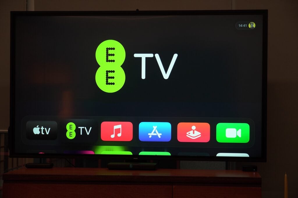
The aim seems to be to blur the edges where live broadcast starts and on-demand begins to the point of being non-existent. You can start watching a programme, hit the ‘up’ button on the remote or the guide button and view content that’s live on other channels, what’s popular with other users, and subscription/on-demand options that you can shimmy through on each rail.
It’s an array of content at your fingertips, but not too much to be overwhelmed by. Helpfully it also indicates clearly content that’s free to watch from what’s available to buy.
It aggregates content from the main UK catch-up and on-demand apps such as iPlayer, Channel 4, ITVX and My 5 that’s accessible through the EPG or at the top of the UI, similar to how Freeview Play looks. Subscribers to NOW and Sky TV bundles can view content as part of their subscription. If you perform a search of Succession, for example, you’ll see options to stream but also to buy and rent.
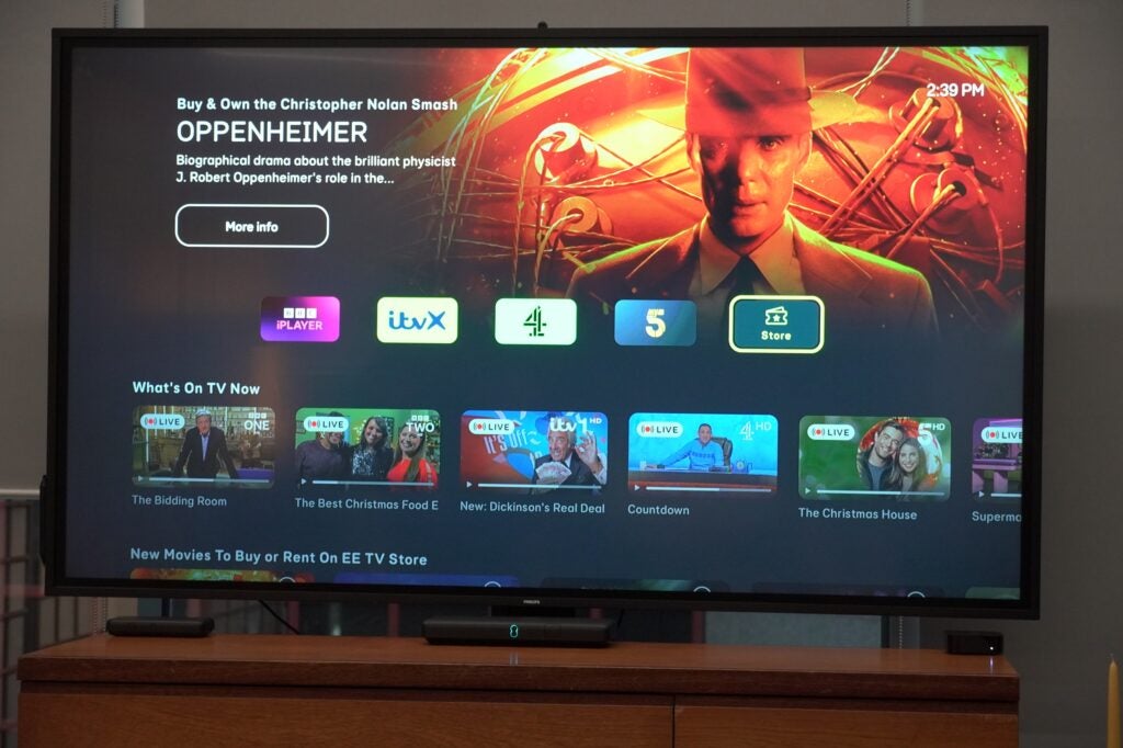
It’s an experience I found slick and intuitive enough once you get a handle on it. For the channel hopping users amongst us, the EE TV app makes it easy to traverse across apps as long as you’re logged in. It is like watching TV via the aerial, except it’s over the Internet.
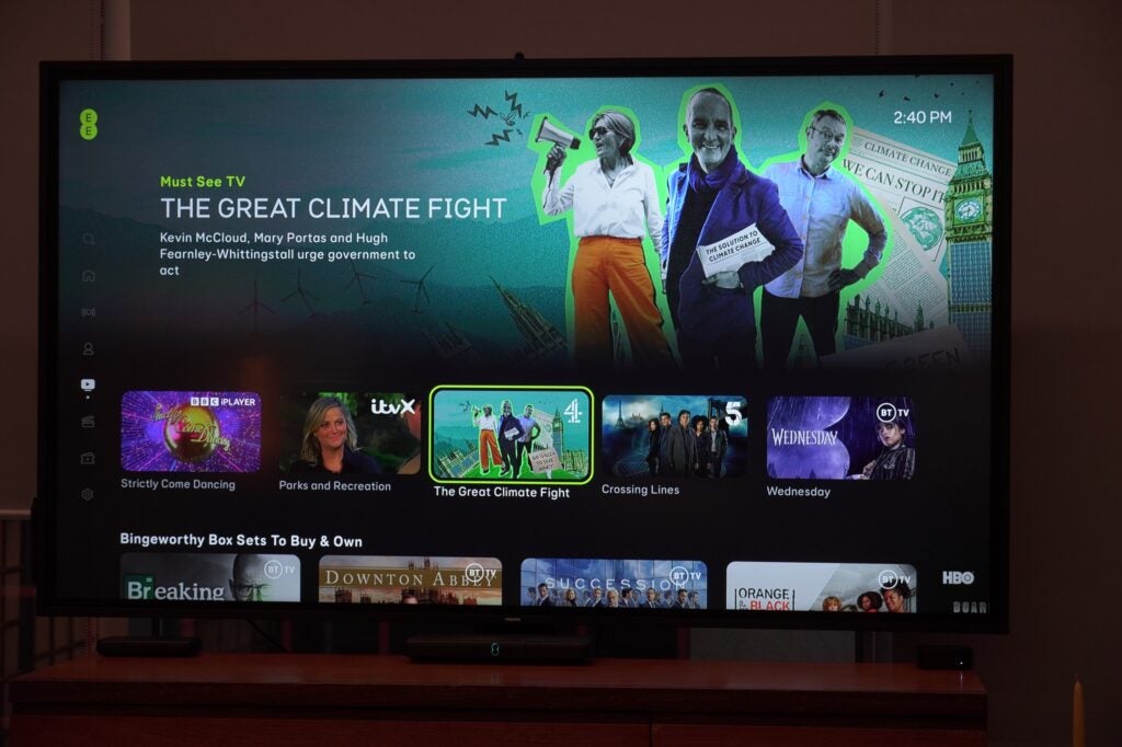
That may appeal to some and less to others as we seemed to have boomeranged back to where we started. The difference is the on-demand section plugged into the interface. I was surprised to see Orange is the New Black on one screen, but it’s available as a purchase from the store, which speaks to EE TV’s perspective of bringing content into one place.
Scroll down the home screen and you’ll find a combination of personalised elements or shows/films popular across the service. I was told there’ll be an editorial team who’ll curate popular programming across EE TV’s content partners.
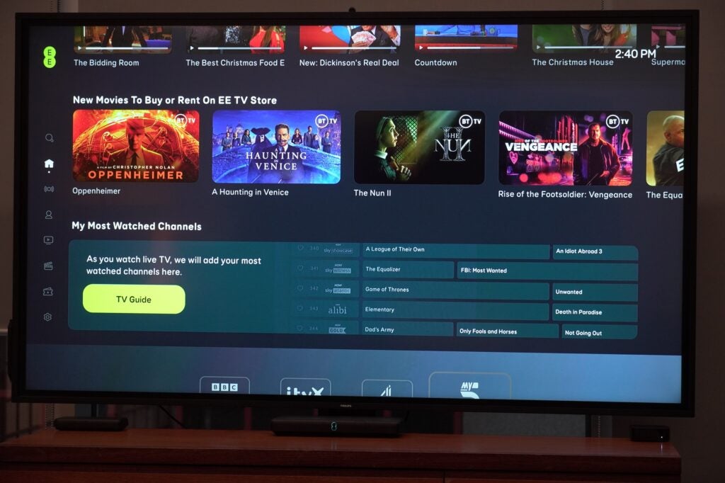
There is the ability to customise the experience by favouriting channels but like Sky Glass and Stream, there’s automation involved. Over time the EE TV app will understand your preferences – you’ll see this in the ‘My Most Watched Channels’ rail on the home screen – with the app able to figure what you like to watch and at what time, and in doing so put those channels to the front of the queue whenever you sit down to watch.
There are other rails available that EE say have proven popular with customers in the past that show films that have just started or sports event that have just began – an interesting ploy to remind people about what’s happening now, and not having to worry about setting a reminder.
Performance
- Dolby Atmos audio
- HDR support
- Requires BT Broadband
There’s not as much to say about the performance except to that it was zippy and fluid moving through the interface. Clicking through to content and starting programmes was also quick, which increases the feeling of being able to start and kick off without delay.
Both the EE TV boxes support Dolby Atmos audio and what’s described as future-proofed 4K HDR. That’s rather cryptic but presumably includes HDR10 and HLG support. When I asked later about Dolby Vision HDR that too was confirmed. The Apple TV 4K comes with both Dolby Vision and HDR10+ formats, so may be the destination for home cinema devotees.

The EE TV Box Pro is the only one that can record content for those that like to keep hold of programming with enough tuners to record four channels simultaneously and 1TB of storage. Apps such as Netflix, Apple TV+, Discovery+, Prime Video, and a few others are supported. EE also expect the service to be updated frequently as it rolls out, so if there’s an app or feature that’s not currently available, it may be in the pipeline for a future update.
To get the EE TV boxes you will need to BT Broadband contract to go with it, which I imagine won’t be as enticing for some. I can understand the reasoning behind it, but if we are heading towards a future of content delivered over IP, restricting the broadband provider is an own goal my books. The EE TV proposition feels primarily targeted towards BT customers as a result.
That said, EE is in the process of improving its broadband speeds to be the fastest of any UK provider, though I’d imagine speeds will depend on where you live and the coverage in that area.
Latest deals
First impressions
There are some interesting things happening with EE TV though arguably this vision of TV’s future is one that feels familiar.
It is slick and intuitive, and the ability to move from live TV to on-demand is quick and easy. I don’t think it’s altogether different from Sky Stream – perhaps I need to spend more time with it – but the underlying idea is the same. Where Sky leads is in its ability to aggregate content from Disney, Netflix, and Prime Video into its UI and search options.
Even the way UK catch-up apps are integrated reminds me of how Freeview Play operates – there are some neat touches and ideas but I’m not sure there’s anything here I’d necessarily describe as game-changing. It is confirmation of the pivot towards Internet streaming that the likes of Sky and Virgin are betting on.
The Apple TV 4K integration is the most intriguing of the lot, especially for iOS users who don’t have a streamer of that ilk in their home given the advanced capabilities it offers. That could well be thing that marks EE TV out from the rest.
FAQs
Regardless of which box you go for, each one will require a £30 activation fee. You’ll also need to have BT Broadband to get the boxes on contract.
First Impressions
EE TV is an intriguing proposition as EE lays out its vision of TV’s future. It does seem more tailored to existing BT customers, especially as it requires take up of BT Broadband. The inclusion of the Apple TV 4K as an option might be the game-changing feature that convinces people to take up EE TV.
Cons
- Requires take up of BT Broadband
-
Record up to 600 hours1TB of storage for the EE TV Box Pro -
AudioSupports Dolby Atmos immersive sound -
AppsAccess to app such as Netflix, Prime Video, Apple TV+ and others
Introduction
Something new comes this way and it’s called EE TV. After EE’s splashy relaunch in October, its taking over the reins from BT and becoming the front-facing consumer brand the British telecoms giant is hoping will push it towards into a brighter future in the living room.
It’s not the first EE has tried to invade the living room, but I imagine they’ll hope it fare better than the last set-top box they tried.
On a gloomy December afternoon, I went over to BT’s offices to see a demonstration of the new service. The proof will be in the pudding once customers have had the chance to fully interact with it, but first impressions are of a slick, integrated, if familiar view for TV’s future.
Design
- Choices of three set-top boxes
- Bluetooth remotes
- Sleek, discreet appearance
EE TV launches with three boxes, one of which might surprise you.
There’s the EE TV Box Pro, which replaces the BT TV Box Pro from a couple years back.

The design is similar in that it’s not an especially tall box, with slim dimensions and rounded edges. Its matte black finish gives it a discreet appearance. There’s the EE TV logo (an infinity sign of sorts) that glows green in the centre that’s used to power the box on and off.
Around the back are the connections, which includes an aerial input, but EE is not expecting that to be the main means of connection. All the EE TV boxes are focused on delivering content over the Internet through Wi-Fi or Ethernet. Much like Sky Stream, think of the aerial input as a back-up in case the Internet goes down.

The design of the EE TV Box Mini shares the same aesthetic but smaller, and EE TV sees this as the box for second rooms in the house – kitchens, bedrooms, anywhere big enough to house a screen. It doesn’t come with an aerial so it’s Wi-Fi (Ethernet) or bust with this option.

Both boxes were designed by Tej Chauhan, whose work goes back to the early 2000s when he was the lead designer on the Nokia 7370 phone. And both boxes have outer casings made from up to 95% recycled plastic, with the box packaging able to be both “recycled and recyclable”.
The third option is the Apple TV 4K. Yes, that Apple TV 4K. It’s like any other current Apple box but carries a bespoke version of the EE TV app integrated within the Apple TV ecosystem. Buy an Apple TV 4K from another retailer and you won’t get the same app, but you’ll be able to download what EE describes as a companion version.

The remote is also a point of difference from other Apple 4K boxes – bigger and with more buttons such as fast-forward and back, a ‘Guide’ button, channel selection and more. For the EE TV boxes, you get the same wand whichever model you purchase, which has the appearance of a more conventional remote with its layout and buttons.
The remote connects to the set-top box via Bluetooth, so you can put the box in your AV rack and close the covers which shouldn’t affect operation. If the remote gets lost (say an errant child has taken off with it), press the logo on the unit and WPS button at the same time and the remote will chime to locate it.

Interface
- Fluid sense of navigation
- Aggregates content from UK catch-up apps
- Combination of personsalised content and curated
Here’s the meat of the streaming sandwich EE TV is offering. The driving force behind the UI is the intention to keep things simple, with live and on-demand content merged into one unified whole.
The EE TV boxes are viewed as more of a live TV experience, whereas the Apple TV 4K is the more app-based option to dip in and out of apps, with the EE TV app bringing the (unified) live TV experience to the Apple platform.

The aim seems to be to blur the edges where live broadcast starts and on-demand begins to the point of being non-existent. You can start watching a programme, hit the ‘up’ button on the remote or the guide button and view content that’s live on other channels, what’s popular with other users, and subscription/on-demand options that you can shimmy through on each rail.
It’s an array of content at your fingertips, but not too much to be overwhelmed by. Helpfully it also indicates clearly content that’s free to watch from what’s available to buy.
It aggregates content from the main UK catch-up and on-demand apps such as iPlayer, Channel 4, ITVX and My 5 that’s accessible through the EPG or at the top of the UI, similar to how Freeview Play looks. Subscribers to NOW and Sky TV bundles can view content as part of their subscription. If you perform a search of Succession, for example, you’ll see options to stream but also to buy and rent.

It’s an experience I found slick and intuitive enough once you get a handle on it. For the channel hopping users amongst us, the EE TV app makes it easy to traverse across apps as long as you’re logged in. It is like watching TV via the aerial, except it’s over the Internet.
That may appeal to some and less to others as we seemed to have boomeranged back to where we started. The difference is the on-demand section plugged into the interface. I was surprised to see Orange is the New Black on one screen, but it’s available as a purchase from the store, which speaks to EE TV’s perspective of bringing content into one place.
Scroll down the home screen and you’ll find a combination of personalised elements or shows/films popular across the service. I was told there’ll be an editorial team who’ll curate popular programming across EE TV’s content partners.

There is the ability to customise the experience by favouriting channels but like Sky Glass and Stream, there’s automation involved. Over time the EE TV app will understand your preferences – you’ll see this in the ‘My Most Watched Channels’ rail on the home screen – with the app able to figure what you like to watch and at what time, and in doing so put those channels to the front of the queue whenever you sit down to watch.
There are other rails available that EE say have proven popular with customers in the past that show films that have just started or sports event that have just began – an interesting ploy to remind people about what’s happening now, and not having to worry about setting a reminder.

Performance
- Dolby Atmos audio
- HDR support
- Requires BT Broadband
There’s not as much to say about the performance except to that it was zippy and fluid moving through the interface. Clicking through to content and starting programmes was also quick, which increases the feeling of being able to start and kick off without delay.
Both the EE TV boxes support Dolby Atmos audio and what’s described as future-proofed 4K HDR. That’s rather cryptic but presumably includes HDR10 and HLG support. When I asked later about Dolby Vision HDR that too was confirmed. The Apple TV 4K comes with both Dolby Vision and HDR10+ formats, so may be the destination for home cinema devotees.

The EE TV Box Pro is the only one that can record content for those that like to keep hold of programming with enough tuners to record four channels simultaneously and 1TB of storage. Apps such as Netflix, Apple TV+, Discovery+, Prime Video, and a few others are supported. EE also expect the service to be updated frequently as it rolls out, so if there’s an app or feature that’s not currently available, it may be in the pipeline for a future update.
To get the EE TV boxes you will need to BT Broadband contract to go with it, which I imagine won’t be as enticing for some. I can understand the reasoning behind it, but if we are heading towards a future of content delivered over IP, restricting the broadband provider is an own goal my books. The EE TV proposition feels primarily targeted towards BT customers as a result.

That said, EE is in the process of improving its broadband speeds to be the fastest of any UK provider, though I’d imagine speeds will depend on where you live and the coverage in that area.
Latest deals
First impressions
There are some interesting things happening with EE TV though arguably this vision of TV’s future is one that feels familiar.
It is slick and intuitive, and the ability to move from live TV to on-demand is quick and easy. I don’t think it’s altogether different from Sky Stream – perhaps I need to spend more time with it – but the underlying idea is the same. Where Sky leads is in its ability to aggregate content from Disney, Netflix, and Prime Video into its UI and search options.
Even the way UK catch-up apps are integrated reminds me of how Freeview Play operates – there are some neat touches and ideas but I’m not sure there’s anything here I’d necessarily describe as game-changing. It is confirmation of the pivot towards Internet streaming that the likes of Sky and Virgin are betting on.
The Apple TV 4K integration is the most intriguing of the lot, especially for iOS users who don’t have a streamer of that ilk in their home given the advanced capabilities it offers. That could well be thing that marks EE TV out from the rest.
FAQs
Regardless of which box you go for, each one will require a £30 activation fee. You’ll also need to have BT Broadband to get the boxes on contract.


